Saturday, March 30, 2013

Boutique Profile: David Yurman Chicago

On a quiet street in a celebrated historic neighborhood lies, unassumingly, the city's David Yurman boutique, whose product selection is great and customer service (newly) unparalleled. I visited the site twice on my last visit to Chicago. Read below for my impressions.

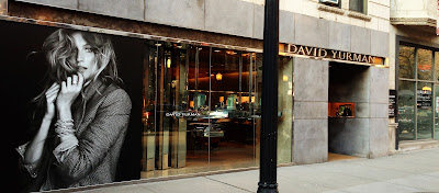
The David Yurman boutique on Oak St. in Chicago, IL
The somewhat subtle boutique storefront


Boutique Details
Address: 40 East Oak Street
Established: 2007
Hours: Monday-Saturday 10-6, Sunday 12-5
Telephone: 312.787.7779
Men's Collection Showcases: 4 (5 including timepieces)
Number of Service Representatives on the Floor: 3-5
DYguy's Favorite Staff: Nina C and Diana B

What Was of Positive Note
Much-Improved Customer Service
In past visits to the boutique, the levels of customer service experienced were inconsistent. I am happy to report this seems a resolved issue. Staff--I interacted with four--were knowledgeable, approachable, and, perhaps most important, legitimately helpful. When I took interest in a product, said product was quickly offered to me as were other complementary pieces. If a ring or bracelet appeared not to fit, the representative with whom I was working made haste to locate, if possible, additional available sizes. I was never made to feel as I did when I called the store in late '12--a burden, an obstacle. No, these were salespeople who were sincerely happy to help, and if that were not, in actuality, the case, if it were all a show, well consider me fooled (albeit happily, willingly so).
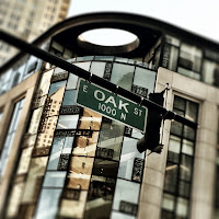
The DY boutique is lcoated on E Oak St., in the heart of the prosperous Gold Coast District.
The boutique is located on Oak
St., one of the most prestigious

shopping lanes in the city.
Extensive Men's Inventory
Four display cases. Of men's jewelry. I was in heaven. What's more, what's there is put, as tends to be the case with David Yurman, on exquisite display. The cases are not just product repositories. They are, truly, nigh works of art that have to be seen to be believed. The placement of each piece in relation to others as well as the case itself is, without question, deliberate. Yes, to call the spatial arrangements exact would be, despite the absoluteness of that claim, a form of understatement. Oh, and in case you are wondering, the themes of the cases, in order from front of store to back, are (1) Exotic Stone, (2) Armory, (3) Diamond- and Gemstone-Encrusted, and (4) Ironwood (le yuck)-cum-Royal Cord.

What Was of Negative Note
Use of Tacky Dell Laptop and Presence of OMG-Bad Chairs
When purchases are processed on the sales floor, staff use a plasticky, what-looks-entry-level Dell laptop whose appearance almost offends the eye. Needless to say, its profanity does not mesh well with the store's otherwise almost impeccable aesthetic.

Note I said "almost." Whoever selected for purchase those belong-in-an-'80s-boudoir, pinkish-mauve sitting chairs positioned just beyond the store's entrance needs... well... a stern talking to as they are not luxury, not sophisticated--indeed--not even tasteful. No, they are just plain bad, and in a store that is otherwise so good--dangerously good, in fact--in taste, their presence is all the more erring.

Have you been to the David Yurman boutique on Oak St. in Chicago? What has been your experience there? Did I get anything wrong in this profile? (Don't even tell me you find those chairs agreeable.) Sound off; post a comment or shoot me an E-mail.

Thursday, March 28, 2013

Why There's No Comparing Tiffany & Co. to David Yurman (with pictures to prove it)

So a female colleague at my day job, knowing my adoration of David Yurman, remarked last week that DY is "great and all" but--and I quote--"we need to get you some Tiffany in your life." Knowing it was unwise to speak what I was thinking (i.e., Are you kidding me?!), I just blinked at her. But, really, are you kidding me? I mean, have you seen the men's collection at Tiffany & Co.? A glance at their offerings, and two words come to mind. Kay Jewelers. OK, so maybe that's not entirely fair. Glorified Kay Jewelers. (And that's entirely fair.)

You see, the offerings at Tiffany's for men are, to me, kind of sad. The line is just... kind of there. I get a sense there is very little corporate investment related to its development. While the pieces offered are sleak and clean in design, they are, in a word, boring. Or maybe "safe" is a better word. Or maybe "unremarkable." They certainly aren't cut to impress, to draw the eye. Still, I suppose that's OK. I mean, goodness knows not everyone wants his or her jewelry to make a statement. One should know, though, that in wanting not one's jewelry to make a statement, a person makes a very loud statement.

But that's enough dithering. My argument, dear reader, is, essentially, this: David Yurman is artistry. Tiffany & Co. produces (for men) accessories. If jewelry is, as Grace Kelly's character contends in Rear Window, "basic equipment," don't you want or, to use the D-word, deserve equipment in its highest form? If you're going to drop $600 on a ring, don't you want to buy the most elegantly-crafted available? That's all I'm saying. DY is on another level, a higher plane than is Tiffany's when it comes to men's collection design. So--what do you say--can we stop comparing apples to oranges?

Now having said that, allow me to present to you a slew of side-by-side product comparison shots. :)

The Basic Cuff
David Yurman Thoroughbred Cable Cuff
David Yurman, $450
Tiffany & Co. cuff
Tiffany & Co., $425

The Classic Band
David Yurman Streamline Band Ring
David Yurman, $425
Tiffany & Co. band ring
Tiffany & Co., $2250

The Cross Necklace
David Yurman Pave Diamond Chevron Cross Necklace
David Yurman, $785
Tiffany & Co. cross necklace
Tiffany & Co., $225

The Trend Ring
David Yurman Maritime Ring with Black Diamonds
David Yurman, $975
Tiffany & Co. trend ring
Tiffany & Co., $475
Do those help to elucidate my argument? See left for original, masterful designs. See right for those that suffice but call to mind pieces found at large-chain jewelry stores (or appear straight from the Armani Exchange catalog).

Tuesday, March 26, 2013

Briefs: Two New Yurmanagrams and DY Is Coming to YYZ

What's new in the world of David Yurman? Give me three--exactly three--minutes of your time, and I'll get you up to speed.

To begin, @DavidYurman has been busy on Instagram these last two days. The 'gram to the left was posted yesterday, the 25th, while the one to the right was posted earlier today. (Want to look closer? Give each image a click.)

a new Yurmanagram showing the setting of a lemon citrine into a bezel of diamonds
The piece pictured resembles DY's Signature
Oval Ring ($2650), only it appears more
round than oblong. I'd love to be a fly on
the wall in that production studio!
a new Yurmanagram featuring bold and beautiful Renaissance bracelets
DY returned to form today, posting
this piece of ad-art, which showcases new
Renaissance bracelets ($4800 for sterling
varieties, $15750 for 18k gold)

David Yurman's original cable bracelet
Before moving on, I'd like to point out for those who do not know the likely reason the bracelets in the second 'gram are part of a collection titled "Renaissance." Take a look here (right) at David Yurman's original cable bracelet, which was handmade by the designer himself back in 1983. Does the designation make sense now? The original cable is enjoying a renaissance in DY's Renaissance collection! How apropos.

OK, now to promulgate my third and final brief. David Yurman is evidently building its first boutique in Canada, a country that has recently been identified as number 8 on the list of the world's wealthy. The boutique is set to open in Yorkdale Shopping Centre in Toronto, a venue that strives to sate the "aspirational rich," later this year.

All right, so there you have it. You are caught up on your Yurman news, and look at that: You have some thirty-odd seconds to spare. Why not spend that time sounding off? Post a comment below or write me an E-mail. Let's go; now you're down to twenty-nine seconds!

Monday, March 25, 2013

How to Stack Your Wrist with Style (and potentially impress Colette Neyrey)

An Instagram from @DavidYurman, which encourages viewers to upload photos of their best bracelet stacks
Wrist candy. Arm party. Bracelet swag (cringe). Whatever you want to call it, the practice of stacking bracelets up and down (and beyond) one's wrist has never been hotter. David Yurman acknowledges this in the company's latest Instagram (see right) in which the following imperative is forwarded: Stack up. Snap off. Impress our Executive Style Director. Evidently those who succeed at doing just that will have their Instagrams featured in DY's Facebook gallery.

So does this mean it's time to take every bracelet, watch, and bauble you own and string them somewhere between hand and elbow? No, in fact, it doesn't. You see, there is an art to properly adorning one's wrist. An art? you think. Please, I don't need to learn how to apply bracelets. Oh no? Based on what I've happened upon via Instagram in recent weeks, I'd beg--heartily, in fact--to differ.

That being said, I'm not here to waste your time nor to prate on endlessly. So I'll be quick. I'll keep my suggestions brief. But I think it in our collective best interest that this posting gets read. (We have some heavy offenders out there.)

DYguy's Three Tips for Bracelet Stacking


1. Stack only pieces that complement or starkly contrast.

And your best bet is to go with those that complement. Stacks are like outfits, like clothing ensembles. Each piece, while important on its own, contributes to the whole. Bear that in mind when stacking to avoid adornment catastrophes. (Don't think they exist? See below.)

2. Stick to a general theme or statement.

What do you want your wrist to say? Limit yourself to one message per stack. Want to exhibit a light and carefree attitude? Great, select pieces that contribute to the development of that aura. Want to go sultry and mysterious? Excellent. Stack accordingly. Avoid going, however, light and sultry or carefree and mysterious. Doing so may set you on a course to Trainwreckville. (Never been? Again, see below.)

3. Give due consideration to overall visual appeal.

Aesthetics matter. Indeed, with jewelry, sometimes they are all that matters. While it's great that Bracelet A represents your free spirit and Bracelet B stands for your resilience, if A and B do not look good together, they probably shouldn't be worn together. You might have to find another way to demonstrate your free spirit... like, by being you. ;)

All right, so there you have my recommendations. Sometimes, however, recommendations aren't enough. Sometimes they need to be seen to be believed. So, with that, here are some stacks that succeed and others that, well, fail to succeed.

an Instagram showing a bracelet stack
SUCCESS. Gold with gold. Clunky with clunky.
Brava, @msyoung07!
an Instagram showing a bracelet stack
FAILURE. Too many colors and shapes, not enough cohesion.
This ^ is why I'm a reluctant stacker.
I don't want to look like I have--for no reason at all--
my entire collection on at once.
an Instagram showing a bracelet stack
SUCCESS. A limited number of pieces are on display,
and each is of medium to medium-high weight.
an Instagram showing a bracelet stack
FAILURE. Too much geometry.
an Instagram showing a bracelet stack
SUCCESS. (1) Makes a bold statement.
(2) All pieces are Yurman.
(3) The red coral spiritual beads provide important contrast.

an Instagram showing a bracelet stack
FAILURE. Lack of statement and order.
an Instagram showing a bracelet stack
SUCCESS. There's much going on, but the arrangement is
orderly, tidy, and, perhaps most important, unified.
(I love, too, the extension of the stack to the ring.)
an Instagram showing a bracelet stack
SUCCESS/SUCCESS/FAILURE.
OK, show me what you've learned:
Which of the three wrists is the mess?

Sunday, March 24, 2013

On Doorsteps Everywhere: The David Yurman 2013 Spring/Summer Catalog Is Here

Catrinel Marlon on the cover of David Yurman's 2013 spring-summer catalog
The catalog's cover.
DY leads with cable and crossover bracelets
(and, of course, Catrinel Marlon).
Received last week by all those on David Yurman's mailing list was the company's latest catalog, a 36-page card-stock document featured product and promotional images from all three of DY's "Dreaming in Color" sub-campaigns, which are, in no particular order, Seduced by Vibrance, Darkness and Light, and Beauty Radiates.

The sole individual on whom DY layers its latest collections in the booklet is brunette bombshell Catrinel Menghia (Marlon), who's evidently all DY wants and/or needs in models this season (not that I am in any way complaining). While the contents of the catalog are, for those who read this blog or subscribe to DY's E-mail updates, anything but "fresh" (practically all images have been featured here or there before), the effect of the aggregate whole remains profound. I've said it before, and I'll say it again--this is going to be the season of Yurman.

the back of the David Yurman spring-summer 2013 catalog on which three one-of-a-kind signet rings are pictured
Yurman seems to have saved the best for last.
I'm loving these striking-in-their-strangeness
signet rings on the catalog's back cover.
Which of the featured designs tickled my fancy the most, you ask? Why, the ones far outside my price range, but of course. (Then again, I am a man so the point is rather moot.) I am taken by the beauty of the catalog's back-cover curiosities, one-of-a-kind signet rings whose jewel-encrusted surfaces recall reptile scale. The creations, which, I have to say, don't have me thinking David Yurman, come in at (from left to right) $17000, $20000, and $15500.

Did you receive DY's latest catalog? If so, which pieces made an impression on you? Sound off by posting a comment below or by sending me an E-mail.

Friday, March 22, 2013

What's This? David Yurman Is Using Social Media as More than Just a Vehicle to Push Product?!

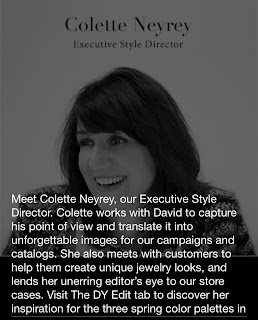
Meet Colette Neyrey, a Facebook posting made by David Yurman on Thursday, March 21, 2013
This profile of Ms. Neyrey serves as the first of
what I hope will be many ad-free Facebook
posts from David Yurman.
David Yurman bemused its Facebook followers yesterday when the company posted this (see right) to its wall. Wait a minute, thought those who subscribe to DY's updates. Where is the promotional image, the same one that's plastered somewhere on DavidYurman.com? Where is the advertising copy? Where is the "update" that, for all intents and purposes, is not an update at all but an advertisement masquerading as such? 

For once, it seems, David Yurman is using social media as social media is intended--to start conversations, to enable the public to feel an intimacy with the company, to help foster something akin to a relationship between a brand and the consumer. Nowhere in this posting is slogan, is a model's Bambi eyes, is product, even. No, instead, the follower is treated to a glimpse--albeit brief--behind the what-often-seems-made-of-steel curtain that separates the David Yurman customer from David Yurman, the corporation. I, for one, find this variety of update not only refreshing but, well, for lack of a better word, necessary. Using social media to hint at or tease a campaign is one thing. Using it to hawk--and hawk hard--that campaign is entirely another. For too long DY has been doing the latter. Maybe this step in the right direction will prove the first of many... or perhaps that's just wishful thinking on my part. Either way, it was very nice to meet Ms. Neyrey, to be introduced to one of the many alchemists at David Yurman.

What are your thoughts on this Facebook posting? Are you in agreement with me or do you hold a dissenting view? Sound off; post a comment or write me an E-mail.

Thursday, March 21, 2013

A Jasper Ring and New Cable Cuff Land on DY.com

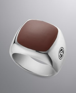
David Yurman Red Jasper Exotic Stone Ring for Men
Red Jasper Exotic Stone Ring, $550
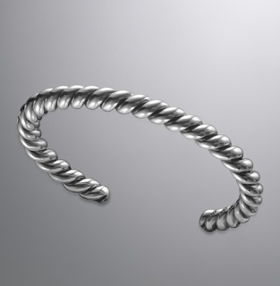
That's right; there are two new additions to the ever-expanding David Yurman men's collection available online at DavidYurman.com. Those additions are a Red Jasper Exotic Stone Ring, priced at $550, and a 6.5-millimeter Thoroughbred Cable Cuff, which rings up at $450. Unfortunately, at the time of writing, only a singular size--that of a ten (10)--is available for the former, while the latter, of course, is adjustable, all the while tending to fit a "standard medium wrist." Remember, if you elect to buy from DavidYurman.com, your order will come to you by way of Neiman Marcus fulfillment out of Texas, which means you may potentially, if you live out of state, save on sales tax. Also, keep in mind standard, ground shipping is always complimentary when you purchase through DavidYurman.com. (Express shipping is also available; the rate is discounted.)

David Yurman Thoroughbred Cable Cuff for Men
Thoroughbred Cable Cuff, $450
What is my take on these new offerings, you ask? Well do let me tell you. I think I'll have to see the jasper ring in person to render a verdict. If the hue of the stone is more crimson than clay, I'm all about it. If it is the reverse, eh, I suppose that will do (albeit not for me). As for the cuff, I love, love, love the overall design, the aesthetic, but I have to admit I find the relative thickness of the piece wanting. I like my cuffs clunky and crafted to intimidate. This one looks as though it could potentially get lost on one's wrist... but maybe that's just me. What are your thoughts on these new arrivals? Sound off in the comments section or by writing me an E-mail.

Wednesday, March 20, 2013

Interview Magazine Identifies David Yurman Pinky Ring as "Most Wanted"

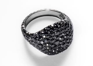
In case you missed it, Interview Magazine listed yesterday David Yurman's black diamond pinky ring for women as its "most wanted" item of the week. The article's writer, Alexandria Symonds, had this to say about the distinctive piece, whose shell of diamonds will set a buyer back $6800:

David Yurman Black Diamond Pinky Ring
This is definitely not your grandpa's signet.
The phrase "ring finger" is a little unnecessarily exclusive, isn't it? We think every digit deserves adornment—and we're starting with the oft-neglected pinky, which can be difficult to outfit for reasons of proportion. A ring too large can overwhelm the finger or, worse, cross over into Mafioso territory; and why bother with a tiny, dainty one? This black diamond creation by David Yurman, a clever update on the signet ring, strikes just the right balance. 

Will you take DY's suggestion and adorn your pinky? If so, are you thinking diamonds or something less audacious? Sound off; leave a comment or write me.

Monday, March 18, 2013

A New Yurmanagram

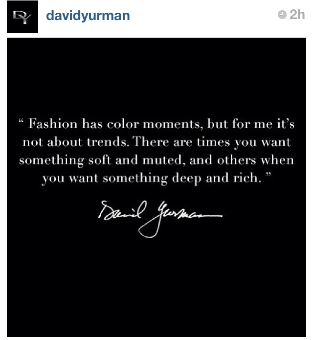
Instagram from @DavidYurman containing a quotation from Mr. Yurman himself
This went online at about 2 PM today.
@DavidYurman posted this (right) to Instagram earlier this afternoon. Evidently, Mr. Yurman speaks as he designs--that is, impossibly well.

For those of you who have images disabled on your browser or for whom reading white-on-black print is difficult, the quotation presented in the image is this:

"Fashion has color moments, but for me it's not about trends. There are times you want something soft and muted, and others when you want something deep and rich."

--David Yurman

Well put, sir. Your adoring public undoubtedly agrees. (I know I do.)

The Strange and Mystical Allure of Meteorite by David Yurman

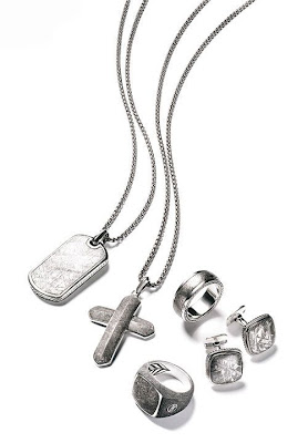
The Meteorite Collection by David Yurman
The Meteorite Collection consists of
two necklaces, three rings (one not pictured),
and cufflinks.
In the last days of 2012, David Yurman debuted its limited-edition Meteorite Collection for men. The pieces, some of which are pictured here, feature cuts of an actual meteorite that purportedly missiled into Africa some time ago.

The moment I laid eyes on the collection I was, in a word, intrigued. I saw the product--the rings, primarily--glistening in the display case, and I'm pretty sure my mouth fell open. Minutes later I had one of those rings on my index finger (yes, I'm that guy who wears jewelry on all digits, excluding the thumb) and almost immediately, my interest waned. Let's get one thing straight here, though: the ring wasn't the problem. Like all DY pieces, it was beautifully crafted, a legitimate work of art. No, the problem was with the stone. Looked at straight on--that is, viewed on a flat plane--the meteorite was, well, dull. Non-reflective. Cloudy.

This transformation in the stone had me perplexed. How could a substance that was resplendent on display look so lousy on one's hand? I flicked my wrist up and, a second later, had my answer.

Right light, wrong angle
Basically, meteorite changes in appearance based on the angle of one's viewing. The best way I can describe it is to draw a comparison to tiger's eye. You know how there appears to be movement in that variety of stone when the jewelry into which it is set is turned from side to side or tilted up and down? The same phenomenon occurs in meteorite. Take a look at these images, and you'll see what I mean.

I now have a meteorite ring in my collection (more on my decision to buy later). Here (to the right) is what the surface of that ring's stone look like when viewed at a 180-degree angle. Yeah. Is that the surface of a "beautiful" mineral or of a scratched-up blackboard? But, now, look below, and you'll see what the piece looks like when viewed from a 90-degree angle. Now, suddenly, there is texture, dimension. Present are angles and stripes--wedges of pattern. For me, part of the magic and mystery of the stone is that its beauty is fickle, or state-dependent. It asks for more from the viewer than a casual glance. Despite its being outwardly unassuming, it is, really, quite the demanding stone.
Right light, right angle

While it has taken me quite some time to come to accept meteorite for what it is--three months elapsed from first encounter to date of acquisition--accept it I have. And so, without further ado, here are the top-three reasons I'm mad about meteorite (and why, perhaps, you should be too):

Reason #3: It gets compliments. Tons of them. From everybody. 

And I don't exaggerate this point. I often wear my meteorite signet ring on the same hand I wear my cognac-diamond band. Not once has a stranger remarked on the latter (despite its being bigger "bling"), but three times this week alone have comments been made about the meteorite.

Reason #2: It is limited edition.

Hey, the fewer made, the bigger the deal it is that you snagged one.

Reason #1: It is from the world beyond.

Friend: "I love your ring!"
You: "Oh, you do? Thanks!"
Friend: "Where'd you get it?"
You: "It's from outer space."
(OK, so you might want to first acknowledge it's David Yurman, but still, you see where I'm going with this.)

Thoughts on meteorite--I know you have them. So share 'em! Post a comment or E-mail me.

UPDATE: Mad about meteorite (and probably due to popular demand), David Yurman has expanded its men's collection for the F/W '13-14 season. Preview the new pieces and get all the details HERE.

Thursday, March 14, 2013

Positive Identification: It's Catrinel Menghia for David Yurman

Catrinel Menghia for David Yurman
Seduced by Vibrance... or by Feminine Beauty?
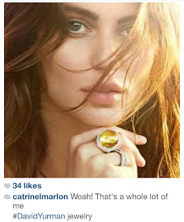
I have been, for days now, posting about the brunette bombshell featured in David Yurman's Spring-Summer 2013 campaign, knowing not who she is. Well, yesterday that all changed with the posting of a tagged Instagram. It turns out the face of DY's latest campaign is none other than Catrinel Menghia, the twenty-seven-year-old Romanian fashion model known best for her work for Giorgio Armani and Fiat. On Wednesday Menghia made this posting to Instagram in which she acknowledges that the beauty is the campaign is, indeed, herself. (Note the unassuming caption.)

Instagram of Catrinel Menghia for David Yurman with the caption, "Woah! That's a whole lot of me."
Menghia posted this to Instagram Wednesday.
Can you blame a guy, though, for not recognizing the famous face, given the work she's previously done? Heck, Menghia is normally done up to the nines with a focus on her body as opposed to her equally-gorgeous face. Yurman has done with her what the company did with Bundchen and has stripped away the Photoshopped veneer through which the the world typically sees the woman. What is present in the shots is not a plasticky fembot but, rather, a ravishing natural beauty who exudes an aura of vulnerability seldom seen in modern advertising. Cheers to Yurman's creative team for viewing and treating Menghia as it does the company's product--as not an object but, instead, a fantastic work of art.

Menghia: Beauty Incarnate.
Also, check out that utterly enchanting (and becharmed!)
tear-drop pendant!

Catrinel Menghia (Marlon) for David Yurman "Darkness and Light"
For the "Darkness and Light" Sub-Campaign

Catrinel Menghia (Marlon) for David Yurman "Darkness and Light"
Menghia adorned in many a variety of bracelet and a pinky ring.

Wednesday, March 13, 2013

Instagram of the Week

I search high and low each week (not really, I just browse images tagged #DavidYurman) in a quest to find what is, in my estimation, the best DY-related Instagram of that seven-day stretch. This week's pick comes from @ryann914.

Yes, this is a stellar in-close-focus shot of some beautiful product, but what sold me on this Instagram was @ryann914's clever caption in which he makes an endorsement--some sixty years late--of racial integration. It is good to know all the same, @ryann914, that you are on the right side of history. ;)

A New Yurmanagram

Posted to Instagram yesterday by @DavidYurman was this low-resolution ad-art, which comes from the spring 2013 "Dreaming in Color" campaign shoot. Why the published image is so terribly pixellated is, I suppose, anyone's guess. As a rule, DY tends to be a very detail-oriented company, and so it is very much surprising to encounter a released image of such low quality. Note, dear reader, that featured again in this Instagram is the same brunette bombshell who is now plastered all over the newly-refreshed DavidYurman.com. You know I love her, but what is your take on this new face of DY?

Monday, March 11, 2013

Alex in Chains: Evan Yurman on Adornment

Evan Yurman. Image courtesy of Jeffrey Prehn.
Late last year, GQ writer Ren McKnight interviewed Evan Yurman, son of David Yurman, and asked him about his "ten essentials"--that is, the products, places, experiences, and general miscellany he cannot live without. Yurman, who now oversees development of the David Yurman men's line, had this to say about men, jewelry, and the anthropology of adornment:


A lot of men want more from their jewelry. They might not be okay with a standard band ring—they want to relate to it in some way. The history of adornment started with man—man killed animal, took a tooth, strung it on his neck. That was the first piece. And then you fast-forward to the Middle Ages when the men adorned themselves with incredible amounts of jewelry—rings on each finger, 100 inches of gold chain around their necks. King Henry was definitely the first Mr. T. I just encourage adornment, you know? Even just a little thread, whether it's mine or somebody else's, I encourage it.

Oh, and in case you are wondering about EY's ten essentials, they include a digital camera, a souped-up motorcycle, spring water, traveling, and a classic car. (Yeah, I know; the list is unremarkable, but hey, I love the quotation.)

Friday, March 8, 2013

Who's Afraid of Roy G. Biv? Yurman Embraces the Luminous This Spring

Pictured is the new face of David Yurman for the spring-summer 2013 season.
Bye, bye, Bundchen.
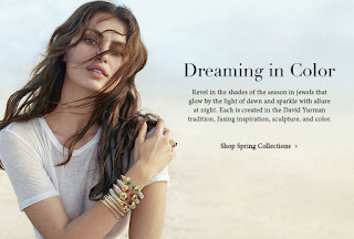
In DY's latest E-mail blast and website feature, the company is encouraging the public to cast off the mantle of winter and go bright and bold. The fresh-from-Photoshop marketing materials are, in color as well as feel, sumptuous but ethereal, light and yet impossibly bright. For two seasons now, DY.com has been awash in black-and-white Bundchen. Now, not only is the company embracing the technicolor, it is doing so with a fresh face--a brunette beauty who never before  has been featured (I think) in a DY campaign.

Get "seduced by vibrance" with the David Yurman Spring-Summer 2013 collection.
Fresh and festive is the DY Spring-Summer 2013 collection.
I could be wrong, but I believe this marketing departure a likely harbinger of the start of the David Yurman Spring-Summer 2013 season, something to which I have, for some weeks now, looked forward. (I understand, too, that a new exotic stone for men in the color of burnt orange has quietly dropped at the Townhouse. It seems we gents will also get the chance to go brash and bold for summer.)

Wednesday, March 6, 2013

Instagram of the Week

I search high and low each week (not really, I just browse images tagged #DavidYurman) in a quest to find what is, in my estimation, the best DY-related Instagram of that seven-day stretch. This week's pick comes from @iamalec07.

It's great to see someone sporting vintage (in a relative sense) men's DY, and of all exotic stones to sport, @iamalec07 is working dino bone, a longtime favorite of mine. What, exactly, is dino bone, you ask? Well, it is not--as an uninformed Yurman salesperson once told me--"carved dinosaur bone." No, I'm fairly certain there are prohibitions against the harvesting of said. The stone called dino bone is actually--and this is according to a custom jeweler--"the result of fossilized bone from dinosaurs in which the cellular structure has been replaced with quartz." But I digress.


Not only is the shot composition here excellent, I love the evocative quality of this Instagram. @iamalec07's devil-may-care, rebel-without-a-cause attitude is, without artifice, so plainly conveyed that one can almost feel the cool of the man behind the lens. Yeah, OK, so I might just be that person who, in my everyday life, rails against the ills of smoking, but I cannot deny I love what smoking and, by extension, the DY brand, to me, represent, and that, my darling readers, is freedom. Freedom? From jewelry that clings, binds, and ties? Oh it's ironic--I'll give you that--but the irony has no bearing on its truth. (And that, being subjective, is undeniable.)

Monday, March 4, 2013

A New Yurmanagram

@DavidYurman posted some new ad-art to Instagram this evening in which the company's Waverly bracelets for women are featured.

Personally speaking, I can't get enough of these clunky, oversize wraps. DY has done a brilliant job, I feel, rendering down his classic cable and building it back up bigger and--dare I say it--better than ever before. Indeed, what the chocolate bar is the to fun-size morsel, the Waverly bracelet is to the timeless--albeit undeniably subtle--cable. And, heck, if given the option, who would choose bite-size over behemoth? #WaverlyfortheWin