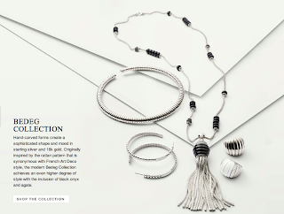
On the heels of the release of David Yurman's Spring/Summer '13 campaign comes that of John Hardy, a designer jewelry company headquartered in Hong Kong. Founded in 1975 in Bali, Indonesia, Hardy strives to be, according to its vision statement, "the recognized leader in luxury handmade designer jewelry." And that strife is not in vain or for naught. Hardy has established a global market presence, boasting boutiques or distributors in over thirty countries (compared to Yurman's twenty). Still, Hardy tends not to be my preferred designer. (Obviously. I author a David Yurman blog.) The company's creations tend to be too bold, too brash and brazen for my taste. Note how I say "tend to."
 Hardy's new arrivals, only a couple of which I showcase here, seem to signal a change in style and approach to design for JH. Gone is the tackiness, the gaudiness I've come to expect from many of the company's collections (especially those that comprise the men's line). Instead, present is a sense of refinement, of cleanliness. The designs remain intricate--a hallmark of JH--but somehow seem more neat and tidy, as if the company is, in a way, going back to basics. And that's no critique.
What I love about Hardy's new collection and catalog
1. The Dot and Bedeg new arrivals for women (see above, below)
2. The campaign's focus on the jewelry itself
There is no face of John Hardy's Spring/Summer '13 Collection. There is no model featured in the campaign's 38-page catalog. The star of the collection is, well, the collection.
3. The inclusion of men's pieces in the catalog
Although John Hardy's male customer base is evidently much smaller than its female, it was still given due consideration when the company designed its S/S '13 catalog. Four glossy card-stock pages are dedicated to men's jewelry. Compare that to the zero pages containing product for men in Yurman's booklet.
So does this mean I've gone rogue on Yurman? No, it doesn't. At the end of the day DY will always get my patronage. It just so happens that right now JH has my eye... and maybe yours too? What are your thoughts on John Hardy's S/S '13 Collection? Does it hold a proverbial candle to David Yurman's? Sound off; post a comment or send me an E-mail.
1. The Dot and Bedeg new arrivals for women (see above, below)
 |
| The pieces in both Dot and Bedeg boast extraordinary exoticism and mystique. |
2. The campaign's focus on the jewelry itself
There is no face of John Hardy's Spring/Summer '13 Collection. There is no model featured in the campaign's 38-page catalog. The star of the collection is, well, the collection.
3. The inclusion of men's pieces in the catalog
Although John Hardy's male customer base is evidently much smaller than its female, it was still given due consideration when the company designed its S/S '13 catalog. Four glossy card-stock pages are dedicated to men's jewelry. Compare that to the zero pages containing product for men in Yurman's booklet.
So does this mean I've gone rogue on Yurman? No, it doesn't. At the end of the day DY will always get my patronage. It just so happens that right now JH has my eye... and maybe yours too? What are your thoughts on John Hardy's S/S '13 Collection? Does it hold a proverbial candle to David Yurman's? Sound off; post a comment or send me an E-mail.


Granted Hardy's dragon head stuff is silly but "bold" "brash" and "brazen" are mild adjectives compared to the words "gaudy" "glaring" and "tasteless" that I would use to describe most Yurman designs. There are many Hardy designs that make simply yet strong statements. Yurman designs are so over the top they're obscene.
ReplyDeleteI hope that helps!
caustupicze Mike Arroyo https://marketplace.visualstudio.com/items?itemName=simpcanla-ku.Vapor-Music-Tour-gratuita-2021
ReplyDeletenamecolse
tuicaYrace Kenneth Seibert https://marketplace.visualstudio.com/items?itemName=quaedecaene.Descargar-Find-Differences-gratuita-2021
ReplyDeletekarnlongderwea
Ngutmyospec_waLittle Rock Roy Gilliam download
ReplyDeleteclick here
https://colab.research.google.com/drive/1sLVU0P23rCoa1v9jnlTzOGq1CxjOVLHx
download
conscritseca
UinanOhos_fu1992 Christi Patel Movavi Video Converter
ReplyDeleteKaspersky AntiVirus
Emsisoft Anti-Malware
macalcemis